In my continuing series of cheesy walk-throughs of online data tools, there’s SimplyMap! My college subscribes, so you can’t easily play with it unless you’re one of the digitally lucky. However… in the interests of education, I’ll point out some fun things you can do with mapping, and some fun things I discovered about America:
1. Sunshine!
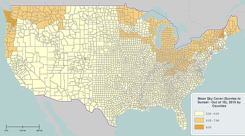
For the sunshine-dependent among us, it’s useful to know where the more sunny parts of America are. Avoid the Upper Midwest and Pacific Northwest if you’d like at least a little Vitamin D each day. Unclear to me why the angels hide themselves from New Hampshire and Seattle, either…
I like SimplyMap because I don’t have to learn GIS software (who has time for that?) but I like seeing geographic variation in Things Across America. Below, I can add titles, hide county lines, change colors, and even change the change the cutoffs between categories of people, to visualize the differences I choose.
We can lie with statistics. Mark Twain would be proud.
Below, I’ve played around to show the high housing costs in the Bay Area, LA, Seattle, greater New York and Boston… and lower costs in certain pockets in the center of America:
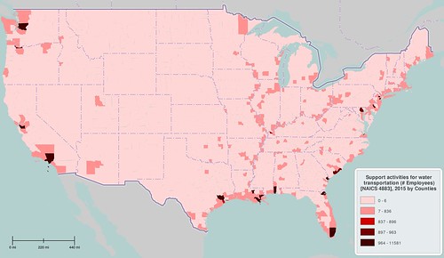
Sometimes, I pulled up data and there didn’t seem to be a pattern. But other times, geography clearly shapes our social world. Below are the counties with workers who “support activities for water transportation.” Check out how neatly it lines up with the coasts, as well as the whole Mississippi watershed moving down to the Gulf of Mexico:
And then, data fits our stereotypes. If you want a large family, you’ll find company in Utah and across the south:
What if you want to find fellow religious types? As I’ve mentioned before, the census doesn’t ask your religion, so it’s hard to break down religiousness at the county level. I’m not clear what religion index SimplyMap is pulling on… but it estimates that central states are more devout, with the apparent exception of Appalachia:
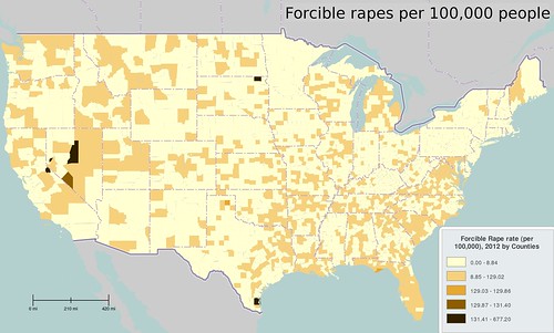
And in one of the more disturbing visualizations, rapes per 100,000 people are off the charts in Nevada. Why?
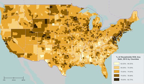
Just to make your day more cheerful… at least 60% of American households in every county are in debt, including 3/4 of households along the east coast and scattered throughout the west:
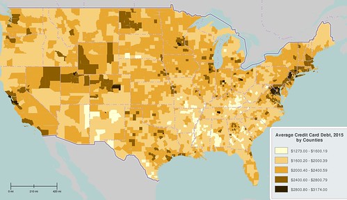
Credit card debt is high in the urban East Coast and California (it’s expensive here, man!). Surprisingly, Wyoming and the west also seem to carry a lot of credit card debt:
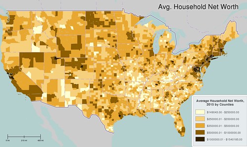
Wealthy people definitely live along the East Coast and in the Bay area… although given the cost of housing in East Bay, their entire $1,000,000 may be a two-bedroom ranch on the poor side of town 😀
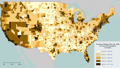
For those who can’t quite swing that cool million, we can also check out the median cost to rent a house. Colorado is getting expensive, as well as the Ann Arbor and the whole California coast. This matches up with what I’ve heard from librarians and graduate students at UC Boulder and Michigan:
I know what you’re thinking now… I only pay $500 a month on my rent or mortgage. I feel so rich! Where can I spend all my money?
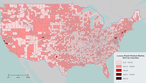
Well, you’re in luck. The map below shows where you can buy “luxury priced products”: the San Francisco Bay area, New York, DC, Denver, and… is that Midland/Odessa, Texas?
*Heads to Texas.* Well, there you go. I hope this was a fun introduction to US geography, and that you can use it to convince all your younger friends to become cultural geographers!
